When defining our brand, it is important to choose a color palette that represents us and is aligned with our values, but it is also essential to select the right typography, that style and typeface that you will use for your designs, but also for your logo and for all your texts.
Typography says a lot more about you than you think!
That’s why in this post I want to give you a few tips so that choosing the best typography for your brand is not a tedious or time-consuming task. I will also share with you my favorites to make it even easier for you. 😉
First of all, let me tell you that there are several typography styles. Among them, we find sans serif, monospaced, slab serif or handwriting. Let’s see the differences between them and which ones suit the personality of your brand.
Serif typefaces
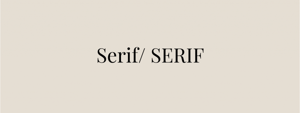
Serif typography is the one that has a small detail at the ends of the strokes of the letters, a kind of cap or terminal. This is known as “serif”. Serif typefaces are ideal for brands that want to convey elegance, character or tradition, although if you combine it with current colors, you can create a modern and stylish brand.
Within this category, my FAVORITES are “Playfair” and “Cormorant Garamond“.
Sans Serif Fonts
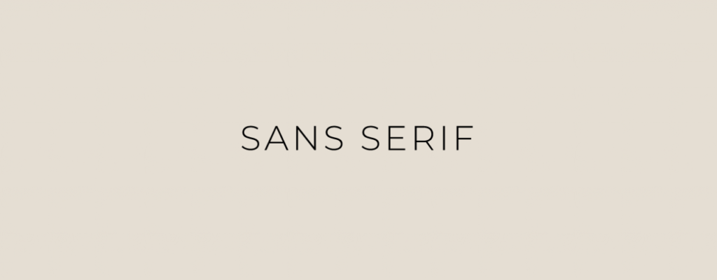
In opposition to Serif, Sans Serif typefaces are those that do not have lines projecting at the ends. These typefaces reflect modernity, innovation, strength and timeliness. They are perfect for brands that want to convey quality, simplicity or minimalism.
Within this category, my FAVORITES are “Montserrat” and “Lato”.
Mono Spaced Typefaces
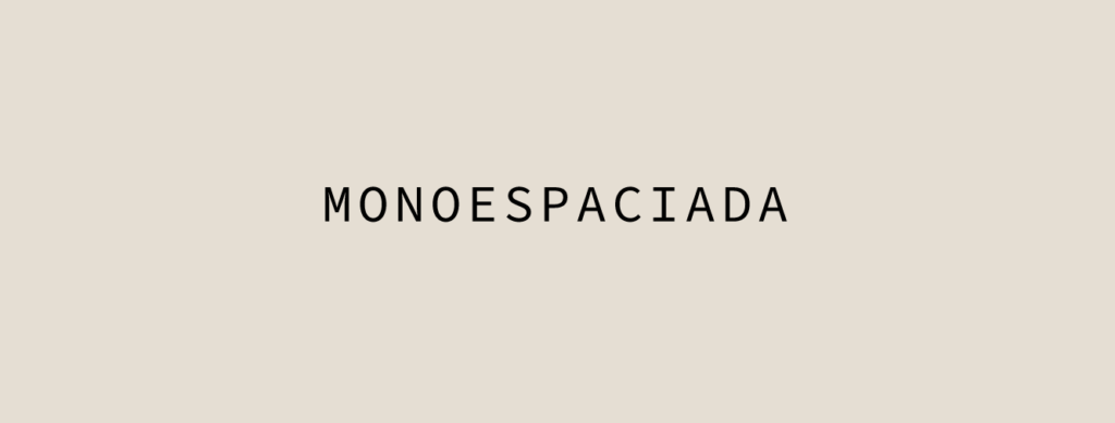
The name says it all: monospaced typefaces are characterized by the fact that their characters always occupy the same space. Did you know that the first monospaced typefaces were designed for typewriters? They are also the fonts most used by programmers, since they are very sharp and easy to read.
They are ideal for logos with a vintage touch. Combined with a handwriting typography you can create a modern brand with personality.
Here my FAVORITES are “Sourde Code Variable” and “Roboto Mono”.
Slab Serif Typefaces
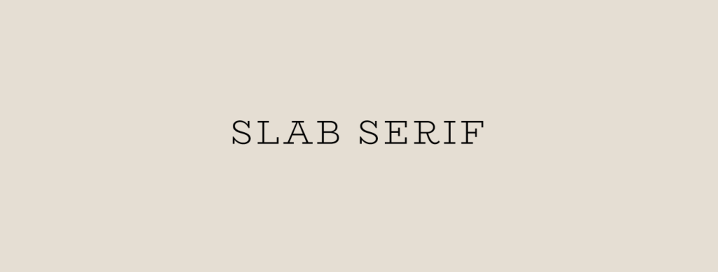
These typefaces also have finials like Serif typefaces, but their letters have no modulation. This typeface appeared in the early nineteenth century for use in advertising and to be read in urban spaces.
They are typefaces with a strong identity and perhaps a bit more masculine than the traditional Serif typefaces due to their geometrical endings.
My FAVORITE Slab Serif is the “Bioryme“.
Handwriting Typefaces
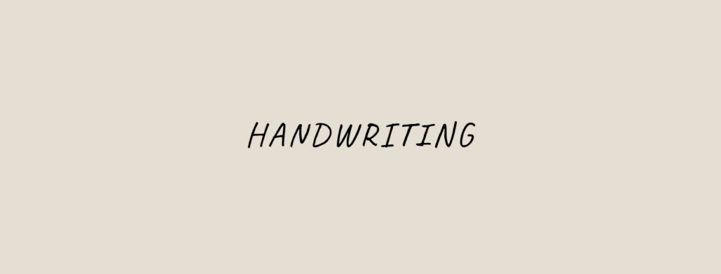
Handwriting typefaces or, what is the same, handmade. This adds a more human, creative and emotional character to the brand. Handwriting typefaces transmit great strength to the brand identity and combined with Sans Serif typefaces they are the perfect mix. They can be used in the logo or as secondary fonts in large headlines. However, in very long texts they are not recommended due to their difficult legibility.
My FAVORITE handwriting are “Caveat” and “Amatic SC“.
Where to get these sources?
Now that you know what typography styles exist and what qualities are associated with each one, it will be easier for you to choose the one that best fits what you want to convey with your brand.
Once you have it clear, you can download these fonts through a multitude of platforms, such as Google Fonts or Dafont, two of the most popular pages for downloading free fonts.
I hope these tips have been useful and that you now have a better understanding of how to choose a good typography for your brand. If you still have any doubts, you can write me through the contact page.
I will be happy to help you!
